Wall Clocks - How to Find the Right Design Wall Clock for Your Home
- Material variety of wall clocks
- Dial - from numeric to roman to striking
- Analogue vs. digital
- Size and mounting
- Conclusion
1. Material variety of wall clocks
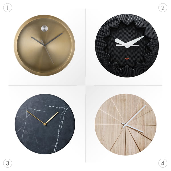
The choice of material for wall clocks depends entirely on your own taste and furnishing style. A wall clock made of metal (1) has a particularly noble appearance and sets shining accents in the ambience, while a wall clock made of plastic (2) often appears somewhat playful. A wall clock made of stone or marble (3) makes a very high-quality, cool impression, wood (4) in turn creates warmth and natural flair in the living room.
2. Dial - from numeric to roman to striking
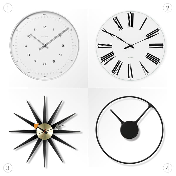
If it is an analogue watch, the dial can be designed in different ways. For a particularly accurate indication of the time, we recommend a dial with hour, minute and second sections and Arabic numerals (1).
For those who prefer a more classical style, there is a watch with Roman numerals and a clear display in hourly segments (2). If the focus is on the design, striking dots as an hour display (3) are sufficient to read the time. Completely minimalist and special are design wall clocks that tell the time only by the position of the hands (4). Here the wall clock clearly functions as a decorative element in the room.
3. Analog vs. digital
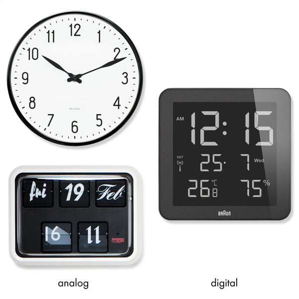
Whether you choose an analogue or digital wall clock depends entirely on the desired functions. Analogue wall clocks are available as classic clock hands or folding number clocks. Folding number clocks can display the time, the date and the day of the week. A disadvantage of analogue wall clocks is often the audible flapping or ticking of the hands. Therefore, a digital wall clock is particularly recommended in the bedroom or guest room. Depending on the model, a digital wall clock can display the temperature and humidity. Especially in bedrooms, this information is helpful for a healthy resting phase.
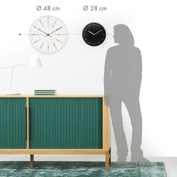
As far as the size of the wall clock is concerned, the basic rule is: The more the design wall clock is to serve as a solo wall decoration, the larger and more present it may be on the wall. Small wall clocks, on the other hand, are well suited for integration into a picture wall or similar.
 "To determine the correct mounting height for your wall clock, you can start from your eye level. This does not apply to wall clocks that are mounted in conjunction with a table - whether it is a desk or a dining table. In this case, the eye level in an upright sitting position is taken as the reference height." - Viktoria, furnishing expert
5. Conclusion
- Different materials make wall clocks look accordingly. Wood appears warm, stone noble, plastic playful and metal sets shining accents in the ambience.
- From the clock face with Arabic numerals to Roman numerals and wall clocks without a clock face - the decisive factor is whether the exact display of the time or the design should be the main focus.
- Classic analogue wall clocks are available with hands and flip-up numbers. Digital versions score points with additional functions such as temperature and humidity display. The advantage of digital wall clocks: They do not tick.
- The wall clock should be mounted at eye level. Mounted above the dining table, you orientate yourself to eye level in an upright sitting position.
Buy design wall clocks online at Connox - Your advantages at a glance
- high-quality wall clocks of the top design brands
- climate-neutral online shopping
- personal support by our customer service
- fair shipping costs
- secure payment thanks to SSL encryption
Purchasing consulting at Connox
You want to buy a wall clock online, but need support? Please feel free to contact our customer service at any time. We will be happy to help you with your purchase, make recommendations and answer any questions you may have. Then let us deliver your desired item directly to your home.
